Form design
The form design defines how a form is displayed in the interactive view.
As with any GUI, form design is a hierarchy whose nodes are components. Components, in turn, can be:
- containers: components that contain other components.
- base components: graphical views of the elements described in the form structure and the form interactive view.
Each component must have its own unique name within the form.
Containers
All children of any container make an ordered list. It is necessary to determine how the child components of each container on the form should be placed. To do this, one of the following types can be specified for a container:
- Vertical container (
CONTAINERV): children are placed from top to bottom. - Horizontal container (
CONTAINERH): children are placed from left to right. - Tabbed panel (
TABBED): at any given time exactly one child component is shown. This component is determined by user via selecting the corresponding tab. - Column container (
COLUMNS): components are placed in a fixed number of columns. When a child component is added, it is placed in the first column with the minimum number of components. In fact, columns are filled first from left to right and then, when the number of columns reaches the specified one, a new row begins, which is located relative to the previous ones from top to bottom; the layout then goes again from left to right and so on. - Vertical splitter (
SPLITV): can be used only if the container has exactly two child components. In this case they are arranged from top to bottom, and the user can change how much space is given to each of them. - Horizontal splitter (
SPLITH): similar to a vertical splitter, but the child components are placed from left to right. - Scrollable container (
SCROLL): can be used only if the container has exactly one child component. This single component occupies all the space it needs in the container, and if there is not enough a scroll bar appears.
In future versions, the last three types of containers (SPLITV, SPLITH, SCROLL) will be deprecated and replaced with the corresponding split and scroll options in vertical and horizontal containers.
The default container type is vertical container (CONTAINERV).
If at some point a container has no child components , or they are invisible, it is automatically hidden. In turn, if a component is not a child of any container, then it will not be shown on the form.
Base components
When defining the form design, the developer can use the following base components, which are created automatically based on the form structure:
Object groups / trees:
- Table/Tree (
GRID): a component consisting of rows and columns in which the rows correspond to object collections of the corresponding group of objects and columns correspond to properties and actions. - System toolbar (
TOOLBARSYSTEM): a panel consisting of buttons with which the user can execute various system actions on the rows in the table. Automatically hidden if the table becomes invisible. - User filter (
USERFILTER): a component with which the user can create and apply their own filters to a table.
Filter groups
- Filter group (
FILTERGROUP): a component with which the user can activate the filters they need in a form's filter groups.
Properties / Actions
- Property panel (
PROPERTY): a component that displays the title and current value of a property. The caption can be either to the left of the value cell or at the top. Not shown if the property is displayed in the table.
Dimensions and components layout
The developer can control how the platform distributes the available container sizes between its internal components, as well as how these components will be located relative to each other.
First of all, for each component you can specify the base size that this component will receive in any case, regardless of the algorithm for placing its container.
To determine the final size of the components and their location inside the container, the following algorithm is used:
For each container, one of the directions is considered to be dynamic, and the other static. The dynamic direction is determined from the name of the container, for example, for a vertical container, the dynamic direction will be vertical; for a horizontal splitter it will be horizontal. For a columned or scrollable container, as well as a tab panel, the dynamic direction is considered to be the vertical. Further, depending on the direction:
-
Dynamic: all components are placed one after another, in the order they are added to the container. Also, extension coefficient (
flex) can be specified for each component. In this case, the space remaining in the container (that is, minus the basic dimensions of all internal components) is divided between all components in proportion to their extension coefficients. -
Static: alignment can be specified for each component (
alignment). Its values can be At the start (START), Center (CENTER), At the end (END), or Stretch (STRETCH). In the first three cases, the component gets its base size as the final size, and is positioned in accordance with the specified type of alignment (that is, at the beginning, center, or end). If Stretch is used as the type of alignment, the final size of the component will be the size of the top container (but not less than the base size), and it will be located exactly in the center.
For example, in the case of a vertical upper container, if the component is set to align at the start then it will be located on the maximum left of the container; if it is set to Stretch, the component will occupy all the space from the left to the right border.
This component layout algorithm is a special case of CSS Flexible Box Layout (and is implemented using it in the web client). For example, the CSS flex-grow property corresponds to the extension coefficient, and flex-basis corresponds to the base size.
The column container breaks its static (horizontal) direction into N identical parts (where N is the number of columns): each part then has its own components, as if this part were a separate vertical container.
For base components, you can specify the automatic size option (autoSize): in this case, the base size will change automatically in to enclose exactly the entire contents of this base component (for example, for a table: all its records plus a title).
The properties layout in a table (or rather, the columns that display their values) is done the same way as if the table were a horizontal container, and the columns of the table were internal components of this container.
Since the current implementation uses the CSS Table Layout Fixed mechanism to place columns inside the table in the Web client, and its capabilities are significantly limited, the extension coefficient for properties displayed in the table can be equal either to 0 or to the base size.
The caption and the value cell are placed inside the property panel in the same way as if the panel were a container (horizontal if the caption is on the left, vertical if at the top), in which the cell has an extension coefficient of 1, the caption is 0 and the alignment of both is set to STRETCH
Property value cell sizes
When displaying properties, you can explicitly specify dimensions of the entire container (together with the caption, if the property is in a panel) and also the dimensions of the value cell itself. To do this, add the prefix value to the size name, e.g. valueWidth). Also, it is worth noting that these dimensions (those of the value cells, and not the entire container) are also used to determine the column widths if the property is displayed in a table.
For property value cells, it is also possible to specify the base width not in pixels, but using a sample value (widthValue) In this case, the platform takes into account the user's font/mask/locale to calculate and set the width in pixels so that the user can see exactly the specified sample value (no more, no less). It is assumed that the sample value must be either a string or of a class equal to the class of the property value.
In addition, cell widths can be specified in characters (charWidth), which is equivalent to giving a string sample value consisting of the given number of zeros.
In the last two cases (that is, when specifying the width as a sample value or in characters), if the property value class implies the presence of buttons on the right during input (for example, DATE class), then the width of this button (21 pixels) is added to the width of the property value cell.
Default dimensions and layout
By default, the extension coefficient and alignment for components are determined as follows:
| Component | Extension coefficient | Alignment |
|---|---|---|
| Table / Tree | 1 | STRETCH |
| Component inside scrollable containers, splitters and tabbed panel | 1 | STRETCH |
| Property panel inside a horizontal container or property in a table. The property values are objects of built-in classes of dynamic length (i.e. strings and numbers) | With of the value cell | START |
| Property panel inside a vertical container. The property values are objects of built-in classes of dynamic length (i.e. strings and numbers) | 0 | STRETCH |
| All others | 0 | START |
The base container size (except the tab panel) is equal by default to the sum of the base sizes of all its child components for the dynamic direction, and the maximum for the static direction. The base height of the tab panel is the sum of the base height of its current tab and the height of the tab title bar, the base width is the same as the base width of the current tab.
The base width of tables/trees is 130 pixels by default, and the height is 70 pixels. The base size of the property panel is determined in the same way as if the panel was a container (horizontal if the caption is on the left, vertical if it is at the top) consisting of the caption and the value cell. The base size of the remaining base components (as well as the caption in the property panel) is determined in such a way as to enclose all the text contained in them.
Property value cell dimensions
The following formulas are used by default to determine the width of a property value cell:
| Property value class | Width unit | Width/Value |
|---|---|---|
| Strings | In characters | IF length <= 12 result = length ELSE IF length = INFINITE result = 15 ELSE result = 12 + (length - 12) ^ 0.7 |
| Numbers | In characters | IF length <= 6 result = length ELSE IF this = DOUBLE result = 10 ELSE result = MIN(6 + (length - 6) ^ 0.7, 10) |
COLOR | In pixels | 40 |
| Files and file links | In pixels | 18 |
BOOLEAN | In pixels | 25 |
DATE | Sample value | 1991_11_21 |
DATETIME | Sample value | 1991_11_21_10:55:55 |
TIME | Sample value | 10:55:55 |
| User classes | In characters | 7 |
The default height of a property value cell is equal to the height of the font used, except properties whose values belong to the TEXT class (in this case, the height is four times the font height).
Window size
If the form opens in window mode it does not have an upper container, so you need to determine this window's initial size. This size is determined similarly to the default base size, the only difference is that for tables/trees the default size is determined not as a constant (the default is 130, 70) but in such a way that it contains their whole contents (similar to the automatic sizing mechanism), but no less than 130 in width and 140 in height.
Default design
An automatic design can be created for each form, based on the form's structure. The developer can modify the automatic design or create a design from scratch.
The automatic design is generated as follows:
BOX: contains all the components of this form. Vertical container. Extension coefficient:1, alignment:STRETCH.PANEL: contains components of the properties that are displayed inPANELview and display group of which is undefined (the property has no parameters). The internal structure and layout are similar to the internal structure and layout of the object group container.GROUP...
OBJECTS: contains all the components that are created for object groups/trees on this form. Vertical container. Extension coefficient:1, alignment:STRETCH.BOX(<object group/tree>): contains all the components of this group of objects. Vertical container. Extension coefficient:1, alignment:STRETCH.GRIDBOX(<group of objects / tree>): contains table / tree. Horizontal container. Extension coefficient:1, alignment:STRETCH.GRID (<group of objects / tree>): the base component of a Table.
TOOLBARBOX(<group of objects / tree>): contains all the components of a toolbar (responsible for layout inside the toolbar). Horizontal container. Alignment:STRETCHTOOLBARLEFT(<group of objects / tree>): the left side of a toolbar. Horizontal container. Alignment:CENTER.TOOLBARSYSTEM(<group of objects / tree>): the base component of the System toolbar. Alignment:CENTER.
TOOLBARRIGHT(<group of objects / tree>): the right side of a toolbar. Horizontal container. Extension coefficient:1, alignment:CENTER.FILTERGROUPS(<group of filters>): contains all the components that are created for filter groups corresponding to a object group. Horizontal container. Alignment:CENTER.FILTERGROUP: base component of a Filter group. Alignment:CENTER.
TOOLBAR(<group of objects / tree>): contains the components of the properties displayed in theTOOLBARview and display group equal to the specified one. Horizontal container. Alignment:CENTER.PROPERTY(<property>): base component of the Property Panel.
USERFILTER(<group of objects / tree>): base component of the User filter. Alignment:STRETCH.PANEL(<group of objects / tree>): contains the components of the properties displayed in thePANELview. Vertical container. Alignment:STRETCH. If several properties belong to groups for which it is necessary to create separate containers, then a corresponding hierarchy of containers is created for them and the components of these properties are placed in it:GROUP(<property group>, <group of objects / tree>): contains components of properties that belong to the specified object group and property group (or do not belong to any property group: in this case the property group is not specified, for exampleGROUP(,a)). Column container.PROPERTY(<property>): base component of the Property Panel.
TOOLBARBOX: contains property components that are displayed inTOOLBARview and have no display group (for example, the property has no parameters). The internal structure and layout are similar to the corresponding internal structure and layout of an object group (except forFILTERGROUPS, which does not make sense when there is no object group, and therefore is not present in this container).TOOLBARLEFT, TOOLBARRIGHT, TOOLBAR...
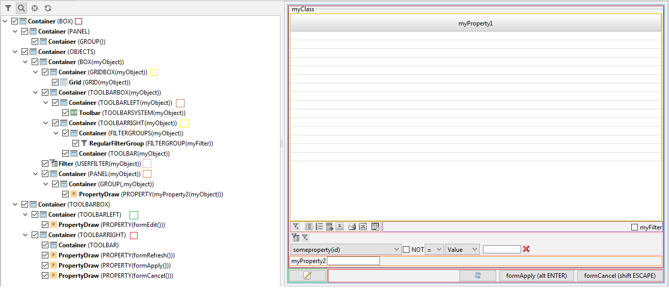
Default design example
FORM myForm 'myForm'
    OBJECTS myObject = myClass
    PROPERTIES(myObject) myProperty1, myProperty2 PANEL
    FILTERGROUP myFilter
        FILTER 'myFilter' myProperty1(myObject)
;
The hierarchy of containers and components in the default design will look like this:
Language
To set up the design of the form, use the DESIGN statement.
Examples
DESIGN order { // customizing the design of the form, starting with the default design
    // marking that all changes to the hierarchy will occur for the topmost container
    // creating a new container as the very first one before the system buttons, in which we
    // put two containers - header and specifications
    NEW orderPane FIRST {
        fill = 1; // specifying that the container should occupy all the space available to it
        type = SPLITV; // specifying that the container will be a vertical splitter
        MOVE BOX(o) { // moving everything related to the object o to the new container
            PANEL(o) { // configuring how properties are displayed in the object o panel
                type = CONTAINERV; // making all descendants go from top to bottom
                NEW headerRow1 { // creating a container - the first row
                    type = CONTAINERH;
                    MOVE PROPERTY(date(o)) { // moving the order date property
                        // "override" the property caption in the form design (instead of the standard one)
                        caption = 'Date of the edited order';
                        //setting a hint for the order date property
                        toolTip = 'Input here the date the order was made';
                        background = #00FFFF; // making the background red
                    }
                    MOVE PROPERTY(time(o)) { // moving the order time property
                        foreground = #FF00FF; // making the color green
                    }
                    MOVE PROPERTY(number(o)) { // moving the order number property
                        // setting that the user should preferably be shown 5 characters
                        charWidth = 5;
                    }
                    MOVE PROPERTY(series(o)); // moving the order series property
                }
                NEW headerRow2 {
                    type = CONTAINERV; // descendants - from top to bottom
                }
                MOVE PROPERTY(note(o));
            }

            size = (400, 300); //specifying that the container o.box should have a base size of 400x300 pixels
        }
        // creating a container that will store various specifications for the order
        NEW detailPane {
            // marking that this container should be a tab panel, where its descendats are tabs
            type = TABBED;
            MOVE BOX(d) { // adding a container with order lines as one of the tabs in the top panel
                caption = 'Lines'; // setting the caption of the tab panel
                // making the row number column never have focus
                PROPERTY(index(d)) { focusable = FALSE; }
                GRID(d) {
                    // making sure that by default the focus when opening the form is set to the row table
                    defaultComponent = TRUE;
                }
            }
            MOVE BOX(s) { // adding a container with sku totals as one of the detailPane tabs
                caption = 'Selection';
            }
        }
    }
}

// splitting the form definition into two statements (the second statement can be transferred to another module)
DESIGN order {
    // removing from the hierarchy the container with the print and export buttons to xls,
    // thereby making them invisible
    REMOVE TOOLBARLEFT;
}
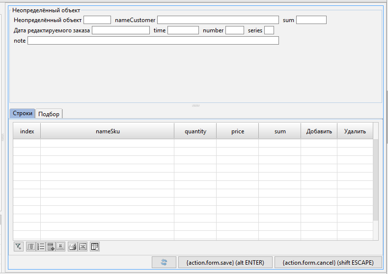
The output is the following form: