Navigator design
Navigator design determines how the navigator is displayed to the user on the screen of his device (we will call the screen space on which the navigator is displayed the desktop).
The navigator design consists of multiple windows, desktop components, each of which displays certain navigator elements.
Each window must have a caption which will be used when displaying the window in the user interface.
Navigator elements layout in windows
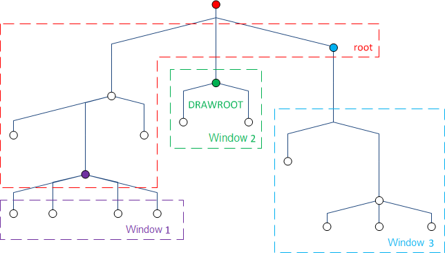
For each navigator element, you can specify the window in which its descendants should be displayed. If necessary, the element itself can be displayed there. Thus, the set of subtrees (navigator elements) that is displayed in each window is uniquely determined. Graphically, this can be represented as follows:
Window layout on the desktop
Each window occupies a predefined section of the desktop. Graphically, this can be represented as follows:


The entire desktop is 100 x 100 points in size. When creating a window, you must specify the window's upper left coordinate, width and height, expressed in points. It is desirable that windows should "cover" the entire area of the desktop. If this does not happen, then the free area will be given to one of the windows (there is no guarantee as to which one). Two windows are allowed to have absolutely identical coordinates and sizes. In this case they will be displayed in the same place, but switching between them will be possible using tabs.
Selected folder
At any moment in time in each window there can be one current user-selected navigator folder. Accordingly, if the element item belongs to a window other than the window of its parent folder, then this element is shown in its window if and only if its parent folder is selected in its window. The predefined System.root folder is always considered to be selected. If at some point a window does not display any navigator element, then that window is automatically hidden.
System windows
There are several predefined system windows that are necessary for the client application to work:
System.forms: a window in which user forms open.System.log: a window in which messages to the user are displayed. If this window is invisible, messages will be shown to the user in the form of system dialog forms.
Also, additional windows are automatically created for ease of development:
System.root: a horizontal toolbar in which it is recommended to display navigator elementSystem.rootchildren. The navigator folderSystem.rootis displayed here by default.System.toolbar: a vertical toolbar in which it is recommended to display some of the descendants of the navigator elements that are displayed in theSystem.rootwindow.System.system: a toolbar with system buttons providing convenient access to the main interface functions.System.logo: a window for displaying the logo.
Default layout
By default, the desktop has the following layout (the left coordinate, upper coordinate, width, and height are indicated in brackets):


Language
To manage windows, use the WINDOW statement.
Examples
// creating system windows in the System module
WINDOW logo HORIZONTAL POSITION(0, 0, 10, 6) VALIGN(CENTER) HALIGN(START) HIDETITLE HIDESCROLLBARS CLASS logoWindowClass();
WINDOW root HORIZONTAL POSITION(10, 0, 70, 6) VALIGN(CENTER) HALIGN(CENTER) HIDETITLE HIDESCROLLBARS CLASS rootWindowClass();
WINDOW system HORIZONTAL POSITION(80, 0, 20, 6) VALIGN(CENTER) HALIGN(END) HIDETITLE HIDESCROLLBARS CLASS systemWindowClass();

WINDOW toolbar VERTICAL POSITION(0, 6, 20, 94) HIDETITLE CLASS toolbarWindowClass();

// a horizontal toolbar at the bottom of the desktop, in which all buttons will be centered and text will be aligned up
// in this toolbar, for example, it is possible to place forms for quick opening
WINDOW hotforms HORIZONTAL BOTTOM VALIGN(CENTER) TEXTVALIGN(START);