DESIGN statement
The DESIGN statement changes form design.
Syntax
The syntax consists of nested blocks of design statements. The outer block, beginning with the keyword DESIGN, defines a form whose design will change:
DESIGN formName [caption] [CUSTOM] {
    designStatement1
    ...
    designStatementN
}
Each designStatement describes one design statement. Design statements are of the following types:
NEW name [insertPos] [{...}];
MOVE selector [insertPos] [{...}];
selector [{...}];
REMOVE selector;
propertyName = value;
The first three statements – create (NEW), move (MOVE), and modify – may in turn contain nested blocks of design statements. The design statements remove (REMOVE) and change property value (=) are simple single statements. Each design statement must end with a semicolon if it does not contain a nested statement block.
Each selector can be one of the following types:
componentName
PROPERTY(formPropertyName)
FILTER(filterName)
FILTERGROUP(filterGroupName)
PARENT(selector)
GROUP([propertyGroupSelector][,groupObjectTreeSelector])
noGroupObjectTreeContainerType
groupObjectTreeContainerType(groupObjectTreeSelector)
In turn, groupObjectTreeSelector can be one of two types:
groupObjectSelector
TREE treeSelector
Description
Using the DESIGN statement the developer can manage the design of the interactive form view by creating, moving, and deleting containers and components, as well as changing their certain properties. By default, a default design is created for each form, along with appropriate containers. If necessary, you can recreate the design without the default containers and previously configured settings. This is done using the keyword CUSTOM.
Each block of design statements enclosed in braces alows to modify a particular component and its descendants. Let's call this component the current component or the current container if we know that the component should be a container in our case. In the external block following the DESIGN keyword, the main container is the current component. There are the following design statements:
- The create statement (
NEW) allows to create a new container, making it a descendant of the current one. The newly-created container will be the current component in the design statements block contained in this statement. - The move statement (
MOVE) allows to make an existing component a direct descendant of the current container. This component is first removed from the previous parent container. The component being moved becomes the current component in the design statements block contained in this statement. - The modify statement allows to modify the specified component which must be a descendant (not necessarily a child) of the current container. The specified element will be the current component in the design statements block contained in this statement.
- The remove statement (
REMOVE) allows to remove a specified component from the component hierarchy. The component to be removed has to be a descendant of the current container. - The change property value statement (
=) allows to change the value of the specified property of the current component.
The component hierarchy described in this statement can have an arbitrary number of nesting levels and describe any number of components and their properties at each level.
To access design components, you can use their names or address property components on the form (PROPERTY), the parent component (PARENT), property group components (GROUP), and other base components/default design components. A property component created by a predefined object operator is addressed by the operator name with its object mapping, for example PROPERTY(NEW(o)), PROPERTY(NEW[Order](o)), PROPERTY(EDIT(o)), or PROPERTY(DELETE(o)), unless the property was given an explicit name on the form.
Parameters
Common parameters
-
formNameThe name of the form being changed. Composite ID.
-
captionThe new form caption in the interactive view mode. String literal. The form caption doesn't change in the navigator.
-
nameThe name of the container being created. Simple ID.
-
insertPosSpecifying the insertion position of the component. It can be specified in one of the following ways:
-
BEFORE selector -
AFTER selectorSpecifying that the component must be added or moved just before (keyword
BEFORE) or after (keywordAFTER) the specified component. The specified component must be a child of the current container. -
FIRSTKeyword indicating that the component should be added or moved to the beginning of the list of child components of the current container.
-
LASTKeyword indicating that the component should be added or moved to the end of the list of child components of the current container. Unlike default addition, components inserted using
LASTwill always be positioned after all components added in the order of insertion. -
DEFAULTKeyword indicating that the component should be added or moved in the order of insertion to the list of child components of the current container. This is the default value.
-
-
propertyNameThe name of the component property. The list of existing properties is provided in the tables below.
-
valueThe value assigned to the corresponding container property. Acceptable value types are provided in the tables below.
Component properties
| Property name | Description | Value type | Default value | Examples |
|---|---|---|---|---|
span | Number of line cells the component occupies in a container laid out in several lines (or as a grid) | Integer literal | 1 | 2 |
defaultComponent | Specifying that this component should get the focus when the form is initialized. Can only be set for one component on the entire form | Extended Logical literal | FALSE | TRUEFALSE |
activated | Marks the component (a tab page) as the one initially selected in its tabbed container when the form opens | Logical literal | FALSE | TRUEFALSE |
fill | Similar to the flex property, the only difference being that if a zero value is set, the align property is set to START, otherwise align is set to STRETCH | NUMERIC type literal | 0 | 1.5 |
size | The base component size in pixels (a value of -1 means that the size is undefined) | A pair of integer literals (width, height) | (-1, -1) | (100, 20) |
height | The base component height in pixels. | Integer literal | -1 | 50 |
width | The base component width in pixels. | Integer literal | -1 | 20 |
flex | Extension coefficient. Value of a property similar to the CSS flex-grow property. Defines how much the component should grow in size relative to other components. | NUMERIC type literal | 0 | 0.25 |
shrink | Allows the component to shrink below its base size along the container's main direction (similar to CSS flex-shrink) | Logical literal | FALSE | TRUEFALSE |
alignShrink | Allows the component to shrink below its base size along the cross (alignment) direction | Logical literal | FALSE | TRUEFALSE |
alignalignment | Component alignment inside the container. Acceptable values: START (at the beginning), CENTER (in the center), END (at the end), STRETCH (stretched). | Alignment type | START | STRETCH |
alignCaption | When the container aligns captions (alignCaptions), draws this component's caption in the shared caption column | Logical literal | FALSE | TRUEFALSE |
overflowHorz | Behavior when the content exceeds the component width: auto (scroll if needed), clip, or visible (CSS overflow-x) | String literal | auto | clipvisibleauto |
overflowVert | Behavior when the content exceeds the component height: auto (scroll if needed), clip, or visible (CSS overflow-y) | String literal | auto | clipvisibleauto |
marginTop | Top margin | Integer literal | 0 | 3 |
marginBottom | Bottom margin | Integer literal | 0 | 4 |
marginLeft | Left margin | Integer literal | 0 | 1 |
marginRight | Right margin | Integer literal | 0 | 1 |
margin | Margin. Sets the same value to the following properties: marginTop, marginRight, marginBottom, marginLeft | Integer literal | 0 | 5 |
captionFont | The font to be used for displaying caption of the component | String literal | depends on the component | 'Tahoma bold 16''Times 12' |
font | The font to be used for displaying the component text — for example, property value, action caption, table text | Expression(string value) | depends on the component | 'Tahoma bold 16''Times 12' |
class | CSS classes of the component (separated by spaces) | Expression (string value) | NULL | some-class-one some-class-two |
fontSize | The size of the font to be used for displaying the component text | Numeric literal | depends on the component | 10 |
fontStyle | The style of the font to be used for the component text May contain the words 'bold' and/or 'italic', or an empty string | String literal | '' | 'bold''bold italic' |
background | The color to be used for the component background | Expression (COLOR value) | NULL | #FFFFCCRGB(255, 0, 0) |
foreground | The color to be used for the component text | Expression (COLOR value) | NULL | #FFFFCCRGB(255, 0, 0) |
panelCaptionVertical | deprecated since version 6, use captionVertical | Logical literal | TRUE | TRUEFALSE |
captionVertical | Indicates that the captions of property or action components should be drawn above the value on the panel | Logical literal | TRUE | TRUEFALSE |
panelCaptionLast | deprecated since version 6, use captionLast | Logical literal | FALSE | TRUEFALSE |
captionLast | Indicates that the value should be drawn on the panel prior to the property caption | Logical literal | FALSE | TRUEFALSE |
panelCaptionAlignment | deprecated since version 6, use captionAlignmentHorz | Alignment type | START | STRETCH |
captionAlignmentHorz | Component caption horizontal alignment. Acceptable values: START (at the beginning), CENTER (in the center), END (at the end), STRETCH (stretched). | Alignment type | START | STRETCH |
captionAlignmentVert | Component caption alignment. Acceptable values: START (at the beginning), CENTER (in the center), END (at the end), STRETCH (stretched). | Alignment type | CENTER | STRETCH |
showIf | Specifies a condition under which the component will be displayed. | Expression (logical value) | NULL | isLeapYear(date)hasComplexity(a, b) |
Container properties
| Property name | Description | Value type | Default value | Examples |
|---|---|---|---|---|
caption | Container header | Expression (string value) | NULL | 'Caption' |
captionClass | CSS-classes of container header (separated by space) | Expression (string value) | NULL | 'some-caption-class' |
valueClass | CSS-classes of container value (separated by space) | Expression (string value) | NULL | 'some-value-class' |
image | Image shown in the container caption: a path relative to the images folder, or a property expression yielding the image | Expression (string value) | NULL | 'image.png' |
collapsible | Lets the user collapse and expand the container; when collapsed, only its caption is shown | Logical literal | depends on the caption | TRUEFALSE |
popup | Shows the container's content in a popup opened from its caption instead of inline (the container starts collapsed) | Logical literal | FALSE | TRUEFALSE |
border | Draws a border around the container | Logical literal | FALSE | TRUEFALSE |
collapsed | Makes a collapsible container start collapsed | Logical literal | FALSE | TRUEFALSE |
horizontal | Container is horizontal | Logical literal | FALSE | TRUEFALSE |
tabbed | Container is tabbed | Logical literal | FALSE | TRUEFALSE |
childrenAlignment | Alignment of child components inside a container. Acceptable values: START, CENTER, END | Alignment type | START | CENTER |
alignCaptions | Aligns child property captions into a shared column so their values line up | Logical literal | depends on the container | TRUEFALSE |
grid | Lays children out as a grid (using lines as the number of tracks and each child's span) instead of a plain linear flow | Logical literal | FALSE | TRUEFALSE |
wrap | Allows children to wrap onto several lines when they do not fit in one | Logical literal | depends on the container | TRUEFALSE |
resizeOverflow | Allows the container to grow beyond the available space when its content overflows (acts as a maximum size) | Logical literal | FALSE | TRUEFALSE |
custom | Renders the container with a custom client-side view (web client only). The value form selects the renderer: a string literal matching [A-Z][A-Za-z0-9_$]* (a bare identifier starting with an uppercase letter) names a React component, while an empty string '', an HTML template string, or a property gives the classic custom view (its name, path, or inline definition) | Expression (string value) | NULL | 'OrderBoard''myView' |
lines | Number of lines (rows or columns) in container | Integer literal | 1 | 3 |
lineSize | Base size of each line track in a multi-line or grid container, in pixels | Integer literal | NULL | 60 |
captionLineSize | Base size of the shared caption-column track when captions are aligned, in pixels | Integer literal | NULL | 60 |
reversed | Reverses the order of child components (and the line direction in a multi-line layout) | Logical literal | depends on the container | TRUEFALSE |
lineShrink | Allows the line tracks of a multi-line container to shrink below their base size | Logical literal | depends on the container | TRUEFALSE |
Properties of actions and properties on the form
| Property name | Description | Value type | Default value | Examples |
|---|---|---|---|---|
autoSize | Automatic component size option. Applies to text components only | Extended Logical literal | FALSE | TRUEFALSE |
changeOnSingleClick | Specifying that change event should be triggered after the property component is clicked once | Extended Logical literal | depends on the property | TRUEFALSE |
hide | Specifying that the property (action) component should be always hidden | Extended Logical literal | FALSE | TRUEFALSE |
maxValue | The maximum numerical value that the property component can have | Integer literal | NULL | 10000005000000000L |
echoSymbols | Specifying that a set of * characters will be displayed instead of the property value. Used for passwords, for example | Extended Logical literal | FALSE | TRUEFALSE |
noSort | No sorting | Logical literal | FALSE | TRUEFALSE |
defaultCompare | Default filter. Allowed values: =, >, <, >=, <=, !=, =* (contains), =@ (fuzzy search). | String literal | depends on the property | > |
valueSize | Width and height of the property value cell in pixels | A pair of Integer literals (width, height) | (-1, -1) | (100, 20) |
valueHeight | Height of the property value cell in pixels | Integer literal | depends on the property | 100 |
valueWidth | Width of the property value cell in pixels | Integer literal | depends on the property | 100 |
captionHeight | Height of the property caption in pixels | Integer literal | -1 | 100 |
captionCharHeight | Height of the property caption in chars | Integer literal | -1 | 5 |
captionWidth | Width of the property caption in pixels | Integer literal | -1 | 100 |
charHeight | Height of the property value cell in characters (rows); -1 means the height is derived from the property value type | Integer literal | -1 | 2 |
charWidth | Width of the property value cell in characters; -1 means the width is derived from the property value type | Integer literal | -1 | 10 |
valueFlex | Forces the value cell to grow and fill the available width, overriding the type-derived default | Logical literal | depends on the property | TRUEFALSE |
changeKey | The key that will trigger the property change event. The definition principle is similar to specifying a parameter in Keystroke.getKeystroke(String) | Expression (string value) | NULL | 'ctrl F6''BACK_SPACE''alt shift X' |
showChangeKey | Specifying that the property caption will include that name of the key shortcut that will trigger the change event | Extended Logical literal | FALSE | TRUEFALSE |
changeMouse | The mouse action that will trigger the property change event | Expression (string value) | NULL | 'DBLCLK' |
showChangeMouse | Specifying that the property caption will include that name of the mouse action that will trigger the change event | Extended Logical literal | FALSE | TRUEFALSE |
focusable | Specifying that the property (action) component or a table column can get focus | Extended Logical literal | NULL | TRUEFALSE |
inline | Renders the property or action inline within its container's flow rather than as a separate layout box | Extended Logical literal | NULL | TRUEFALSE |
panelColumnVertical | In a panel, stacks the property's column-group columns vertically instead of horizontally | Logical literal | FALSE | TRUEFALSE |
class | CSS-classes for property (separated by space) | Expression (string value) | NULL | some-class-one some-class-two |
footerClass | CSS-classes for property footer (separated by space) | Expression (string value) | NULL | some-footer-class |
valueClass | CSS-classes for the property value (separated by space) | Expression (string value) | NULL | some-value-class |
captionClass | CSS-classes for the property caption (separated by space) | Expression (string value) | NULL | some-caption-class |
caption | Caption of a property or action | String literal | caption of a property or action | 'Caption' |
tag | HTML tag used to render the value element (for example input, a, button, select); overrides the auto-chosen tag | String literal | NULL | 'a' |
inputType | HTML input type used when editing the value (for example password, range); overrides the type-derived default | String literal | NULL | 'password' |
image | The path to the file with the image to be displayed as an action icon. The path is specified relative to the images folder | String literal | NULL | 'image.png' |
imagePath | deprecated since version 6, use image | String literal | NULL | 'image.png' |
comment | Comment of a property or action | Expression (string value) | NULL | 'Comment' |
commentClass | Class of comment of property or action | Expression (string value) | NULL | 'comment-class' |
panelCommentVertical | Indicates that the comment of property or action should be drawn above or below the value on the panel | Extended Logical literal | FALSE | TRUEFALSE |
panelCommentFirst | Indicates that the comment should be drawn on the panel before property value | Extended Logical literal | FALSE | TRUEFALSE |
panelCommentAlignment | Comment component alignment inside the container. Acceptable values: START (at the beginning), CENTER (in the center), END (at the end), STRETCH (stretched). | Alignment type | CENTER | STRETCH |
placeholder | Placeholder of a property or action | Expression (string value) | placeholder of a property or action | 'Placeholder' |
pattern | Property value formatting template. The syntax of template definition is similar to the DecimalFormat or SimpleDateFormat syntax, depending on the value type | Expression (string value) | NULL | #,##0.00 |
regexp | The regular expression that the property value must match during input | Expression (string value) | NULL | '^((8|\\+7)[\\- ]?)?(\\(?\\d\{3\}\\)?[\\- ]?)?[\\d\\- ]\{7,10\}$' |
regexpMessage | The message to be shown to the user if they enter a value that does not match the regular expression | Expression (string value) | default message | 'Incorrect phone number format' |
tooltip | The tip to be shown when the cursor hovers over the caption of a property or action | Expression (string value) | Default tooltip | 'Tip' |
valueTooltip | The tip to be shown when the cursor hovers over the value of a property | Expression (string value) | Default tooltip | 'Tip' |
valueAlignment | Component value alignment. Acceptable values: START (at the beginning), CENTER (in the center), END (at the end), STRETCH (stretched).deprecated since version 6, use valueAlignmentHorz | Alignment type | START | STRETCH |
valueAlignmentHorz | Component value alignment horizontal. Acceptable values: START (at the beginning), CENTER (in the center), END (at the end), STRETCH (stretched). | Alignment type | depends on the property | STRETCH |
valueAlignmentVert | Component value alignment vertical. Acceptable values: START (at the beginning), CENTER (in the center), END (at the end), STRETCH (stretched). | Alignment type | depends on the property | STRETCH |
panelCustom | Uses a custom layout for the property in a panel instead of the standard caption-and-value layout | Logical literal | depends on the property | TRUEFALSE |
valueOverflowHorz | Behavior when the value content exceeds the cell width: auto, clip, or visible (CSS overflow-x) | String literal | depends on the property | autoclipvisible |
valueOverflowVert | Behavior when the value content exceeds the cell height: auto, clip, or visible (CSS overflow-y) | String literal | clip | autoclipvisible |
valueShrinkHorz | Allows the value cell to shrink below its base width | Logical literal | depends on the property | TRUEFALSE |
valueShrinkVert | Allows the value cell to shrink below its base height | Logical literal | depends on the property | TRUEFALSE |
highlightDuplicate | Highlights cells whose value repeats another cell's value in the same column | Logical literal | depends on the table | TRUEFALSE |
wrapWordBreak | When the value wraps, allows breaking inside long words rather than only at spaces | Logical literal | FALSE | TRUEFALSE |
ellipsis | Truncates overflowing value text with an ellipsis | Logical literal | depends on the property | TRUEFALSE |
collapse | Collapses the value cell to a single line, without expanding for multi-line content | Logical literal | depends on the property | TRUEFALSE |
captionWrap | Allows the property caption text to wrap onto several lines | Logical literal | depends on the property | TRUEFALSE |
captionWrapWordBreak | When the caption wraps, allows breaking inside long words | Logical literal | FALSE | TRUEFALSE |
captionEllipsis | Truncates an overflowing caption with an ellipsis | Logical literal | TRUE | TRUEFALSE |
captionCollapse | Collapses the caption to a single line | Logical literal | FALSE | TRUEFALSE |
clearText | Specifying that the current text should be reset when input starts | Extended Logical literal | FALSE | TRUEFALSE |
notSelectAll | Specifying that the text is not selected at the start of editing | Extended Logical literal | FALSE | TRUEFALSE |
askConfirm | Specifies that an attempt to change the property (execute an action) will show a confirmation request | Extended Logical literal | FALSE | TRUEFALSE |
askConfirmMessage | Text of the confirmation request shown when an attempt to change the property (execute the action) is made | String literal | default message | 'Are you sure you want to modify this property?' |
toolbar | Whether the value cell shows its own small control toolbar | Extended Logical literal | depends on the property | TRUEFALSE |
toolbarActions | Whether the value cell's toolbar includes the property's action buttons | Extended Logical literal | depends on the property | TRUEFALSE |
notNull | Specifies that in case of a NULL property value, the component of this property should be highlighted | Extended Logical literal | the property's notNull | TRUEFALSE |
select | Renders the value as a selection control over its possible values; a string chooses the control kind (for example 'dropdown', 'list', 'buttongroup', 'input'), and NULL disables it | String literal | NULL | 'dropdown' |
defaultValue | Default value (on start editing, only for custom interpreter) | Expression (string value) | NULL | default valuedefaultValue(a, b) |
Toolbar properties
| Property name | Description | Value type | Default value | Examples |
|---|---|---|---|---|
visible | Specifying the visibility of the component | Logical literal | TRUE | TRUEFALSE |
showGroup | Show the view buttons deprecated since version 6, use showViews | Extended Logical literal | TRUE | TRUEFALSE |
showViews | Show the view buttons | Extended Logical literal | TRUE | TRUEFALSE |
showFilters | Show the filters setting button | Extended Logical literal | TRUE | TRUEFALSE |
showSettings | Show the table setting button | Extended Logical literal | TRUE | TRUEFALSE |
showCountQuantity | Show the row quantity calculation button | Extended Logical literal | TRUE | TRUEFALSE |
showCalculateSum | Show the column sum calculation button | Extended Logical literal | TRUE | TRUEFALSE |
showPrintGroupXls | Show the XLS export button | Extended Logical literal | TRUE | TRUEFALSE |
showManualUpdate | Show the manual update button | Extended Logical literal | TRUE | TRUEFALSE |
Grid properties
| Property name | Description | Value type | Default value | Examples |
|---|---|---|---|---|
autoSize | Makes the table size itself to its content instead of filling the available space | Logical literal | FALSE | TRUEFALSE |
boxed | Drawing a frame (box) around a component | Logical literal | TRUE | TRUEFALSE |
tabVertical | Specifying that focus will be moved from top to bottom (not from left to right) | Extended Logical literal | FALSE | TRUEFALSE |
quickSearch | Specifying that the table will support quick element search | Extended Logical literal | FALSE | TRUEFALSE |
headerHeight | Header height in pixelsdeprecated since version 6, use captionHeight | Integer literal | NULL | 60 |
captionHeight | Header height in pixels | Integer literal | NULL | 60 |
captionCharHeight | Header height in chars | Integer literal | NULL | 5 |
resizeOverflow | Allows the table to grow beyond its allotted space when rows overflow (acts as a maximum height) | Logical literal | FALSE | TRUEFALSE |
lineWidth | Base width of a table row's content line, in pixels | Integer literal | NULL | 60 |
lineHeight | Base height of a table row, in pixels | Integer literal | NULL | 60 |
enableManualUpdate | Enables the manual update mode by default | Extended Logical literal | FALSE | TRUEFALSE |
hierarchicalWidth | Width of first tree column | Integer literal | NULL | 100 |
hierarchicalCaption | Caption of first tree column | String literal | 'Tree' | Tree caption |
Other properties
| Property name | Applies to | Description | Value type | Default value | Examples |
|---|---|---|---|---|---|
visible | custom filter, class tree | Specifying the visibility of the component for setting custom filters (class tree) | Extended Logical literal | TRUE | TRUEFALSE |
selector parameters
-
componentNameName of a design component. Simple ID.
-
formPropertyName -
filterNameThe name of a filter on the form. Simple ID.
-
filterGroupNameThe name of a filter group. Simple ID.
-
propertyGroupSelectorThe name of a property group. Simple ID.
-
groupObjectSelectorThe name of an object group on the form. Simple ID.
-
treeSelectorThe name of an object tree on the form. Simple ID.
-
noGroupObjectTreeContainerTypeType of form container:
BOX– a common form containerOBJECTS– contains the components of all object groups / trees on the formPANEL– contains components of properties that are displayed inPANELview and display group of which is undefined.TOOLBARBOX– a common toolbar container with property components that are displayed in the panel, marked for placement on theTOOLBAR, and for which no object group is defined.TOOLBARLEFT- the left part of the toolbarTOOLBARRIGHT- the right part of the toolbarTOOLBARcontains components of properties that are displayed inTOOLBARview and display group of which is undefined.POPUP– the collapsed popup container (the "⋮" overflow menu)
-
groupObjectTreeContainerTypeThe type of an object group / tree container.
- All types of containers of the
noGroupObjectTreeContainerTypeform exceptOBJECTS(identical semantics) GRID- a table componentTOOLBARSYSTEM- a system toolbar (number of records, group change, etc.).FILTERGROUPS- contains filter group componentsFILTERBOX- contains the user filter and its controlsFILTERS- a component that displays custom filtersFILTERCONTROLS- the user filter controls
- All types of containers of the
Examples
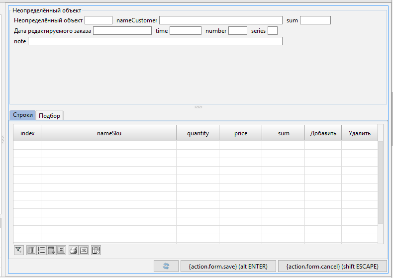
DESIGN order { // customizing the design of the form, starting with the default design
               // marking that all changes to the hierarchy will occur for the topmost container
    // creating a new container as the very first one before the system buttons,
    // in which we put two containers - header and specifications
    NEW orderPane FIRST {
        fill = 1; // specifying that the container should occupy all the space available to it
        MOVE BOX(o) { // moving everything related to the object o to the new container
            PANEL(o) { // configuring how properties are displayed in the object o panel
                horizontal = FALSE; // making all descendants go from top to bottom
                NEW headerRow1 { // creating a container - the first row
                    horizontal = TRUE;
                    MOVE PROPERTY(date(o)) { // moving the order date property
                        // "override" the property caption in the form design (instead of the standard one)
                        caption = 'Date of the edited order';
                        // setting a hint for the order date property
                        tooltip = 'Input here the date the order was made';
                        background = #00FFFF; // making the background red
                    }
                    MOVE PROPERTY(time(o)) { // moving the order time property
                        foreground = #FF00FF; // making the color green
                    }
                    MOVE PROPERTY(number(o)) { // moving the order number property
                        // setting that the user should preferably be shown 5 characters
                        charWidth = 5;
                    }
                    MOVE PROPERTY(series(o)); // moving the order series property
                }
                NEW headerRow2 {
                    horizontal = FALSE; // descendants - from top to bottom
                }
                MOVE PROPERTY(note(o));
            }

            size = (400, 300); //specifying that the container o.box should have a base size of 400x300 pixels
        }
        // creating a container that will store various specifications for the order
        NEW detailPane {
            // marking that this container should be a tab panel, where its descendats are tabs
            tabbed = TRUE;
            MOVE BOX(d) { // adding a container with order lines as one of the tabs in the top panel
                caption = 'Lines'; // setting the caption of the tab panel
                // making the row number column never have focus
                PROPERTY(index(d)) { focusable = FALSE; }
                GRID(d) {
                    // making sure that by default the focus when opening the form is set to the row table
                    defaultComponent = TRUE;
                }
            }
            MOVE BOX(s) { // adding a container with sku totals as one of the detailPane tabs
                caption = 'Selection';
            }
        }
    }
}

// splitting the form definition into two statements (the second statement can be transferred to another module)
DESIGN order {
    // removing the container with print and export to xls buttons from the hierarchy, thereby making them invisible
    REMOVE TOOLBARLEFT;
}
The output is the following form: